
2 min read
The Design of Everyday Things
by Don Norman
An object can make a reasonable action feel like a personal mistake.
One-Page Story
At eight fifteen, the station’s new ticket machines began to collect a small crowd. The screens were bright enough to reflect the people standing in front of them. A woman with a folded pushchair tapped the fare she wanted, then tapped it again when the screen returned to the first menu. A man in a blue coat held his card against the reader until the machine spoke too quietly for him to hear.
Sanjay stood beside the information desk, which had not yet opened. His job was platform support, not tickets, but commuters had learned to find the person in the orange vest. “It wants a zone,” the woman said. The screen had asked for a destination, then displayed a map with four colours and no town names. Sanjay pointed to a small arrow at the bottom. The arrow opened a second map. The woman found her stop, paid, and left with the pushchair rattling behind her.
For the next forty minutes, Sanjay showed people the arrow. He showed them where the receipt printed, behind a panel marked only by a thin line. He told a student that the machine had accepted her card even though the message had disappeared. He took a passenger to the desk when the machine charged him twice.
At nine, the station manager came through with two visitors from the company. They watched a man buy a weekly pass without asking for help. “Much faster,” one visitor said. The manager smiled. “People are getting used to it.”
Sanjay was behind a column with a traveller who had missed the airport train. The traveller had pressed cancel because it was the only word he recognized. Sanjay found the transaction waiting behind another screen. By the time the pass printed, the platform had emptied.
“Next one?” the traveller asked.
Sanjay nodded and walked back toward the machines. On the far screen, a new person was tapping the first menu twice.
Why This Book Matters
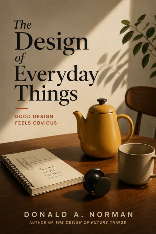
The Design of Everyday Things gave human-centred design a durable public language for affordances, signifiers, feedback, constraints, and the gap between an object’s appearance and its actual use.
Its most generous intervention is refusing to treat ordinary confusion as proof that a user has failed. Norman asks designers to make action discoverable before a person has to guess.
Should You Read It?
Read it if...
- You want to notice why ordinary doors, controls, signs, and interfaces can feel obvious, confusing, or quietly exhausting.
- You are interested in design as a way of respecting human attention rather than displaying technical cleverness.
Skip it if...
- You need a current technical specification, specialist usability method, or detailed product-design process.
- You want design treated mainly as style, novelty, or a catalogue of visual preferences.
Try This Today
Watch the workaround
Notice one moment when someone asks another person how to use an everyday object or interface. Before offering advice, look for the signal, feedback, or constraint that the object failed to provide.